Back

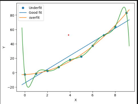
Blue line (Underfit) — too simple, misses the pattern. Like using a 200-day moving average on a fast-moving market. Misses most signals.Teal line (Good fit) — captures the real trend without chasing noise. This is what you want your model to be.Orange/Green line (Overfit) — memorised every data point perfectly including the noise. Looks amazing in backtest, fails completely on live data.
Post image
May 26, 2026 · 03:25 AM · 8 views
1 Reposts
4 Likes
0 Replies

No replies yet. Be the first to respond!