Hi everyone.
I usually never post on social media, my last post was probably more than 10 years ago on Facebook. I kinda dislike social media, to be fair, and even more since all the sloppy AI posts. But nowadays it seems we have no choice but to network in order to find work or collaborate with each other: HR won't read thousands of easy applies on Linkedin and CVs made by ChatGPT.
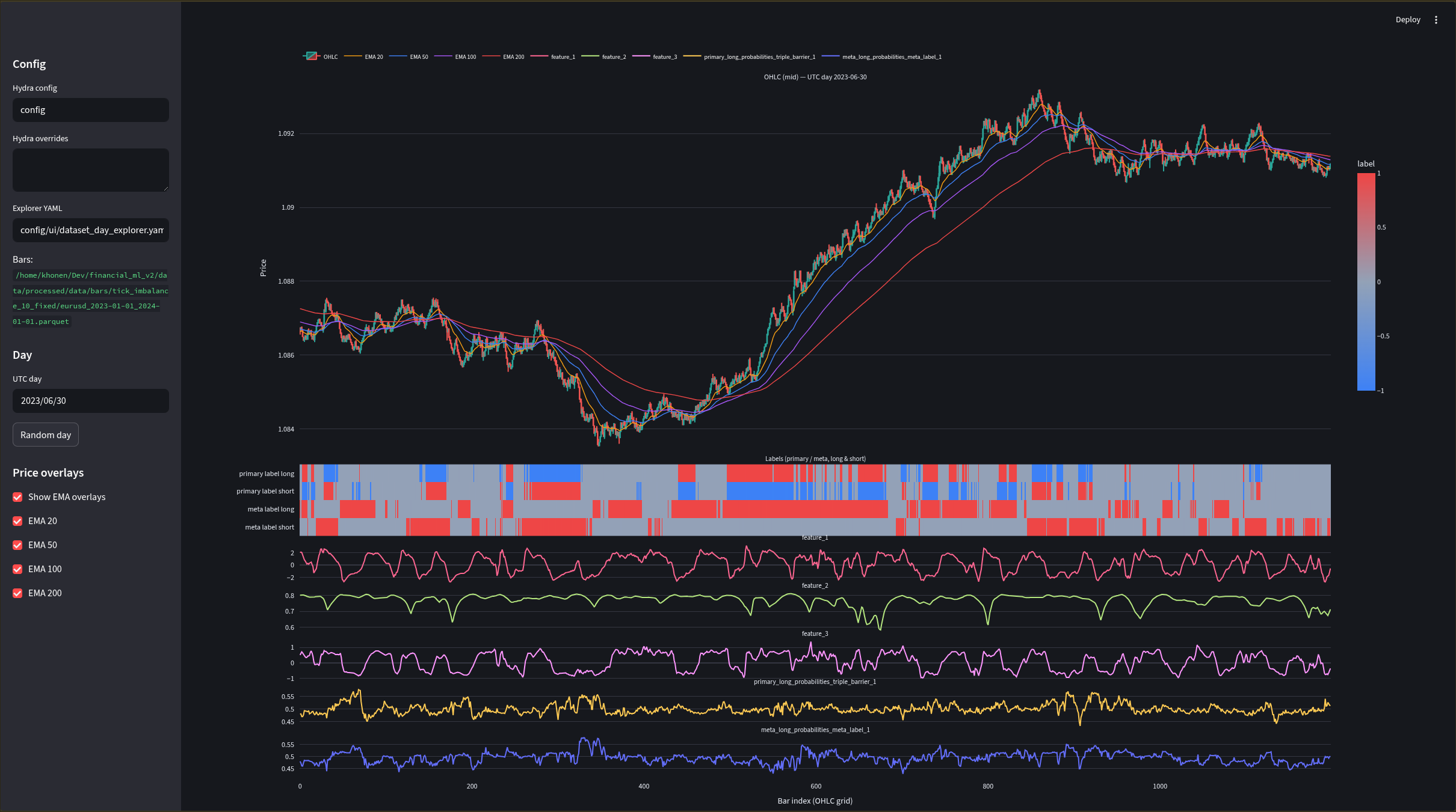
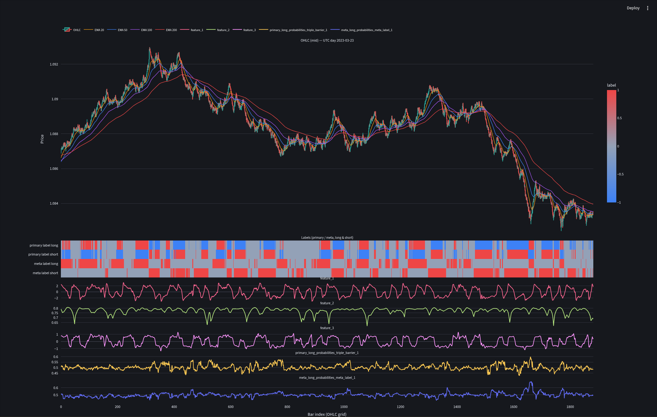
I am currently working on my quant research lab where I can easily plug and play my machine learning pipelines and automate research analysis based on config. Here is an OHLC chart visualizer made with Streamlit where I can plot my sampling, features, labels and model outputs. Having a statistical analysis of your research is great, but we must also see what's going on in the market with our data. So the visualizer is a good complement to my reports.
The labels and models are inspired from Advances in Financial Machine Learning by Lopez de Prado. I was looking for ways to maybe smooth or customize my labels to avoid noise: we don't want our model to enter a bullish label candle when there are only a few bullish candles. If you have some ideas, let me know, I would greatly appreciate it. Same if you have ideas to improve the data visualizer.
Thanks for reading me, I hope it was not too long.