Code
13 lines
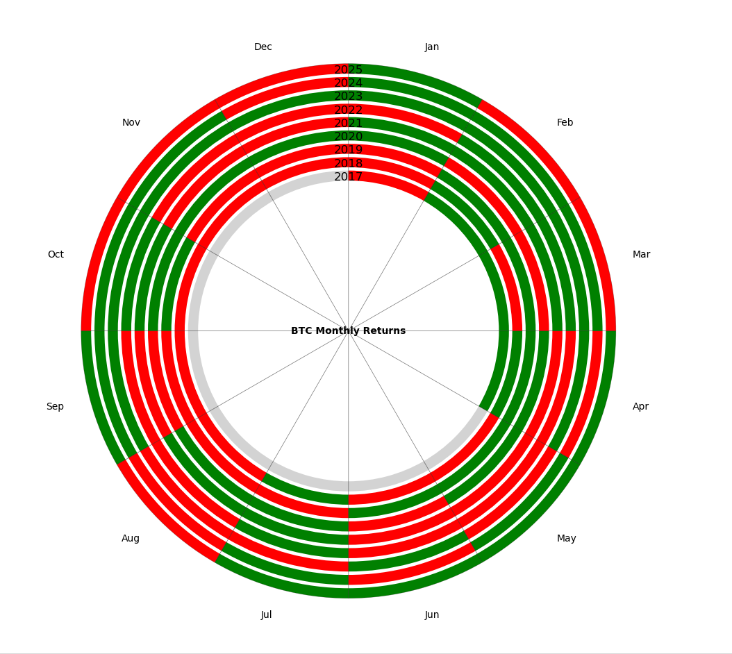
Main functionality :
sectors = np.array(12 * [30])
years = [2024, 2023, 2022, 2021, 2020, 2019, 2018, 2017]
offsets = [0.2, 0.4, 0.6, 0.8, 1.0, 1.2, 1.4, 1.6]
for i, year in enumerate(years):
    data = get_year_returns(year)
    plt.pie(sectors,
            startangle=90,
            colors=computeyear(data),
            counterclock=True,
            wedgeprops={'width': ringwidth},
            radius=radiussize - offsets[i])
the get_year_returns function is months data
2
Reposts
8
Likes
7
Replies